Leopard
 My friend has a copy of Mac OS X 10.5 (Leopard) from the WWDC, and I got a chance to play with it today.
The first thing I noticed is that it’s basically the same as Tiger, which may cause many who aren’t interested in the gee-whiz-bang uberfunctions and under the hood changes to say, “Uh? $129? Bite me.”
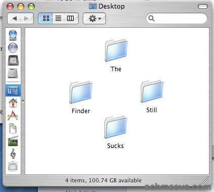
There are lots of under the hood changes, and I plan to play with it a bit more, but Apple seems to be focusing on things like iChat, Mail, Time Machine, and Spaces (virtual desktops! oh, how 1998! albeit a nice implementation) when there’s some things in real need of improvement. Like the Finder. It gets some improvements, but it’s still just not what it needs to be. It remains the weakest link in the OS. At the very least, Apple should provide the hooks for Finder replacements (like PathFinder) to become “the” Finder, so I can really ditch the thing once and for all.
Some other observations:
- Spotlight seems faster, yet still a bit lacking. It’s nice to recognize new types, and include meta searches, but why can’t I ctrl-click from the results window and open as I please? This one place Windows just does it better.
- Mail has Notes and To-Dos. All fine and well, but not sporting a chub over this…
- Safari’s new find is pretty cool, but it lacks one thing Firefox has had for years: just start typing and find — if no cursor is focused. This seems basic.
- Safari web clippings into Dashboard: nice, but c’mon, that was too easy…
- Address Book needs Map Of options for more than MapQuest… GPS in cars is really common now, why not download to car? A few are starting to offer this.
- .Mac Sync has supposedly been improved, and includes a few new options. I haven’t tried it, as it supposedly invalidates my “Tiger” style syncing, but the prefs now include Dashboard, Dock Items, and Preferences (which, not specified). This has been a major weak point for Apple. .Mac syncing is ugly at best, and an utter failure most of time. It’s nice they opened up it up to third parties, but that doesn’t work really either. The system is just boinked, period. But I want it — my bookmarks, my address book, iCal items, Yojimbo items, whatever. This is all really vital. Apple — this really needs to work.
- Time Machine. It’s a back up system. I haven’t tried it yet, but it seems to lack options that allow me to feel comfortable. Basically, the options are: ignore or include a volume, but what the hell are you backing up? How much is it going to cost me? Where are you going to store it?
- Brushed metal? Not? Who? What? When?… Just stop it. Unify. I know these things need changes over releases, but they need to relate to something. A type of application, functional use, easy of usability, whatever…
I’ve got my beefs. It’s still, what, 6 months until release. Inevitably, someone will ask: “How about Vista?” Um, I’ve got the beta of that too, and it has some charms, and I hate to simplify, but OS X is not Windows. Thankfully, beautifully, praise-jesbusely, it’s not Windows.
And Leopard doesn’t suck 1GB just sitting idly at the desktop.
comments